UX/UI design of a recipe manager mobile app for INF 132 at UCI
Team Name: J.T.H.E.V.
Team Members: Jeffrey Qin, Taravee Tichilasuntron, Huan Dang, Evan Yeh, and Vigneshwar Reddy Boggula
We initially wanted to address the problem of food waste and its environmental consequences. Our original problem statement was, “How might we help mobile-literate home cooks eliminate household food waste and help the environment by managing produce and using the contents of their refrigerators?”. We would later modify this after our insights from user research and interviews.
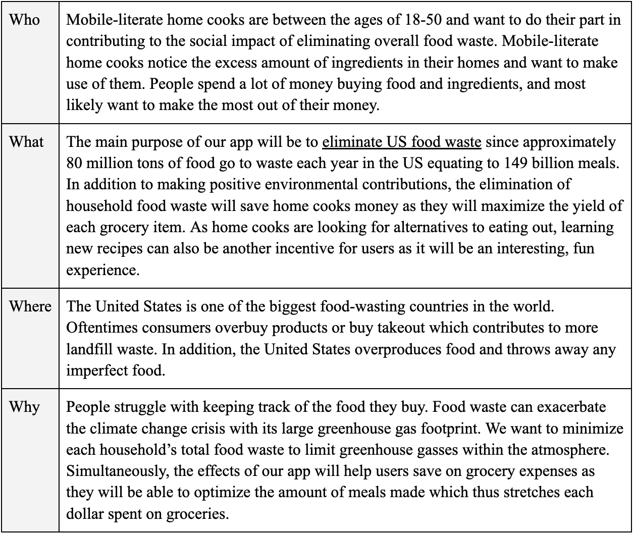
Based on this original problem statement, we created a Who, What, Where, and Why table. It allowed us to establish the significance of the issue and identify the stakeholders along with their needs. The table includes articles and statistics to demonstrate the problem's magnitude and significance. This helped us identify the severity of the problem and stakeholders related to our problem statement. It also helped list potential metrics that can be used to measure the success of a solution we would create.
A competitive analysis helped us understand existing solutions that are used to currently address our problem statement. We described these solutions and if they adequately addressed our problem statement. We analyzed five mobile applications: myfitnesspal, OhAPotato, SuperCook, Yummly, and eatthismuch.
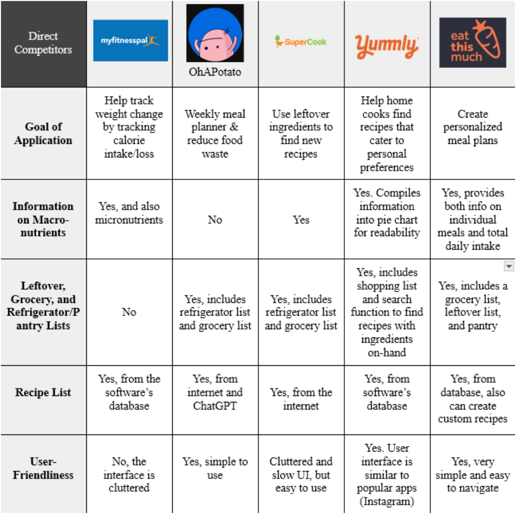
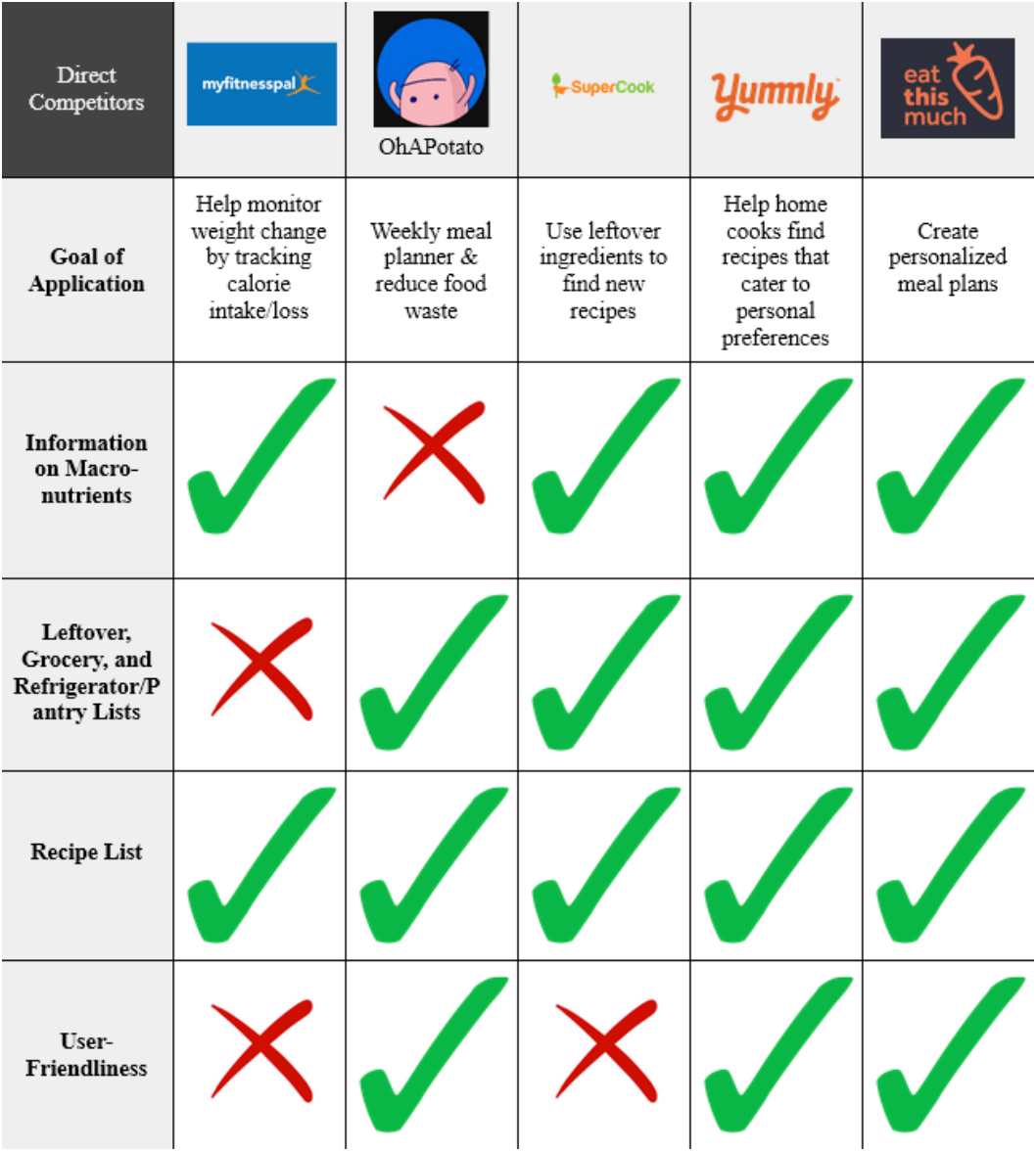
Throughout the technologies analyzed, there were multiple and a variety of gaps. A common weakness that all the apps share is their clunky search engines and recipe lists. For all the apps, the user must always type their ingredients into their search engines or pantry lists. To improve the user experience and usability, the apps should allow the user to save ingredients for future use. To solidify that these gaps matter and to look for additional features that users may want, we moved on to interviews.
After our competitive analysis, we made our user research plan based on the problems we identified on existing products and to determine user needs and wants from our target demographic. Preliminary work included creating an interview guide, practicing interviewing with our peers, and creating an interview protocol. We ideated multiple questions, before deciding on our interview protocols. Our interviews revealed that our target audience had little to no interest in eliminating food waste. They instead listed other reasons and matters that concerned them the most: convenience, budgeting, user-friendly interface, time-efficiency, and deliciousness.
Convenience and busy schedules are key factors driving people's decision to eat out over cooking at home. Budgeting is another main concern, people want to manage their expenses effectively, but they overspend on groceries and take-out. Interviews also revealed that recipe apps with simple interfaces that enhance user-friendliness are more likely to be used and preferred. There is also a desire to learn new recipes, but time-consuming recipes and difficulty in following them hinder this. The taste of food is also a priority since people consistently want delicious food so they seek meals that satisfy their wants and preferences. We had many quotes by interviewees that expresses each of the sentiments listed. The following are the most representative quote for each topic:
• "If cooking at home was not time-consuming, I would cook more at home. Cooking for me usually takes 3 hours which includes prepping, cooking, and washing dishes. 3 hours is a lot of time" (Huan, Interview #1)
• "For a week, I try to keep it around $50-70." They are conscious and active about maintaining their expenses but they do sometimes waste food and therefore money. This is expressed when they state "It's a bit frustrating, especially considering the cost" (Vigneshwar, Interview #2)
• "Easy to navigate, categorized list of recipes, and the app can suggest recipes based on what I have in my fridge and pantry" (Vigneshwar, Interview #1)
• "I would love to learn more recipes outside of what I already know, but it seems like it would take a long time to do so" (Evan, Interview #2)
• "Would the app allow me to customize some recipes to my liking? I love spicy food so is there a way it can cater to that" (Taravee, Interview #1)
Based on these insights, we changed our problem statement. From interviews with the demographic we were trying to appeal to, we realized that young adults and university students are struggling with budgeting and managing food. As they become independent, they prioritize their finances since the cost of living has generally been on the rise while salaries/wages have not been able to keep up. This leads to university students and young adults becoming financially conscious and leaving them with no choice but to prioritize their budgeting over environmental responsibilities. As a result of our findings from our interviews, we changed the problem statement to: How might we help mobile-literate home cooks save money by managing produce and using the contents of their refrigerators?
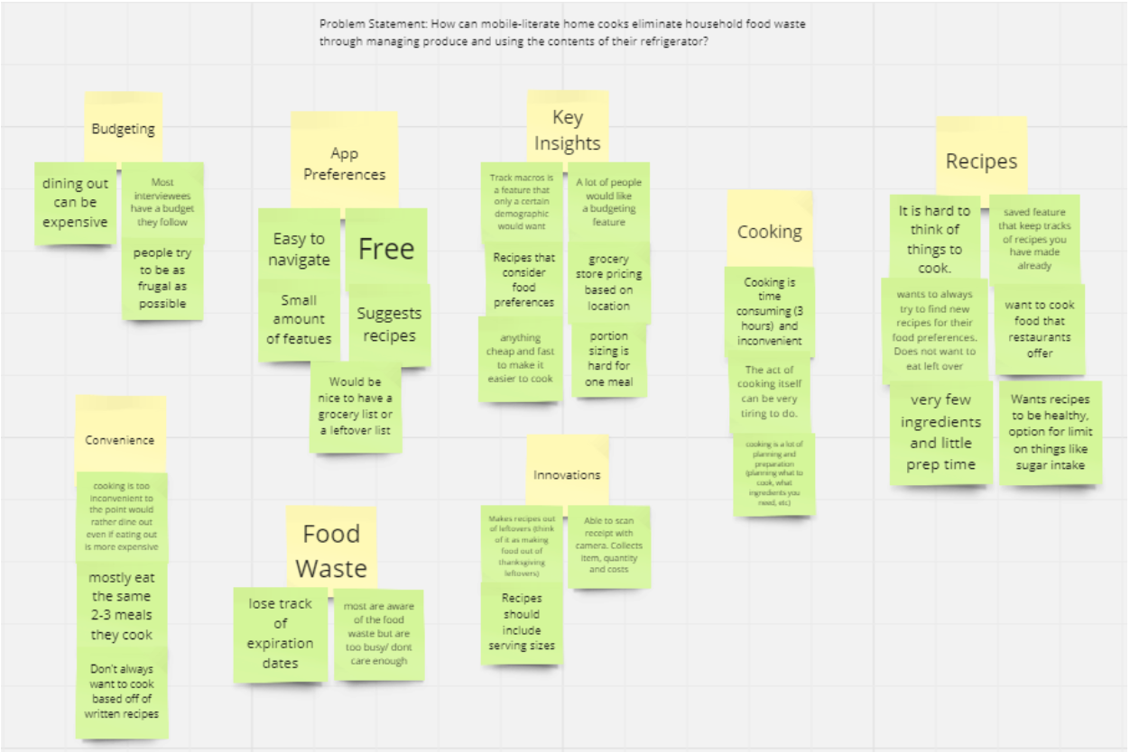
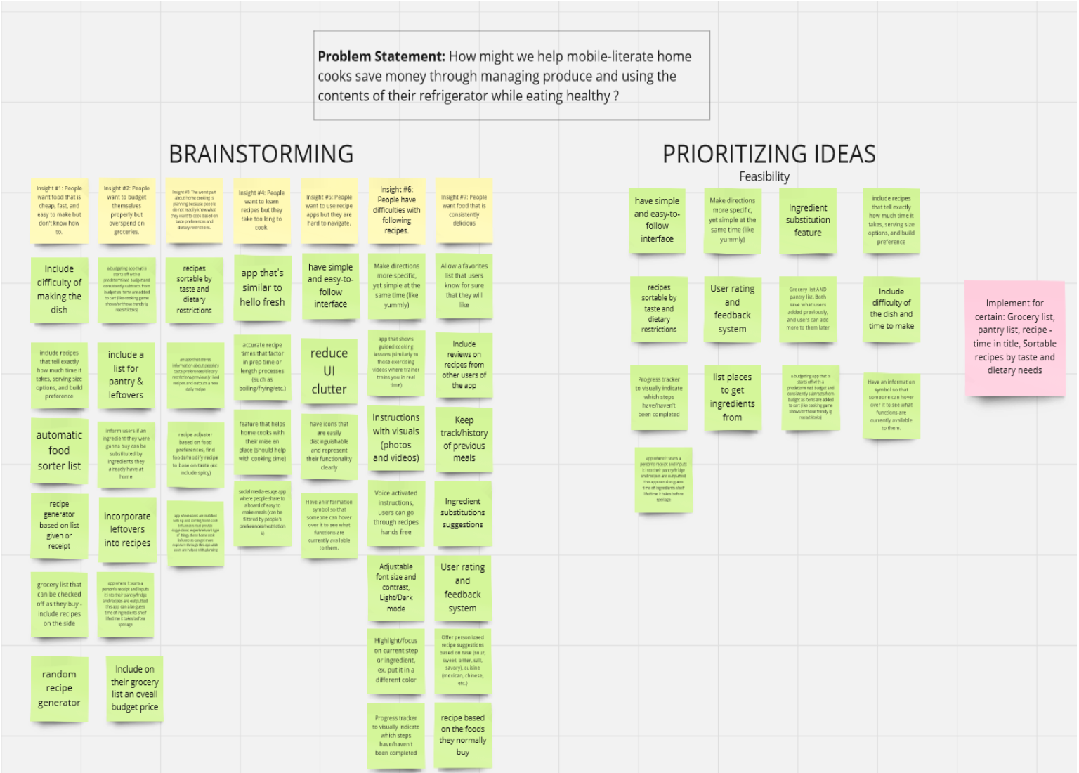
To define what our application would help our users with, we created an affinity diagram to find key insights into what our consumers would want. After reviewing the entire group's interview results, we listed as many insights as possible. We were then able to narrow down the affinity diagram to highlight the key insights we wanted to go further in-depth and integrate into the design of our app. In the end, we pivoted towards ideas and solutions for a problem statement that better reflects our intended audience needs.
We generated ideas and solutions to our problem statement by listing all of our thoughts on Miro board and prioritizing them. After generating all of our ideas gathered from the interviews, we narrowed down our ideas in terms of feasibility, landing us at the problem statement we have currently. Through this we created a must implement list, which included the grocery list, pantry list, recipe list, and some sort of filtering system. All of these features were later implemented in our final prototype, showing how efficient this process was.
The persona and storyboards are based on the insights we gathered from our interviews. Our persona allowed us to better understand the type of users we might cater to. This made us critically think about what elements we might include to solve their pain points. Our storyboards also greatly enhanced our perspective on how an app like ours is able to help people. It allowed us to visualize the steps it might take or frustrations users face.
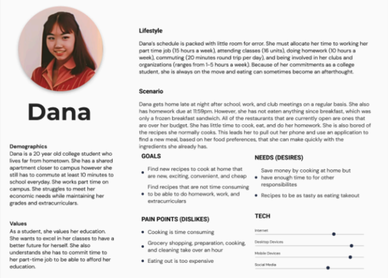
Our persona, Dana, represents one of our targeted audiences who would use this application. It allowed us to understand what the user may need, their behavior and their frustrations. Our team used this persona to internalize what features we might want to implement to help our user. After creating the persona, we were able to better determine what our targeted consumers would want.
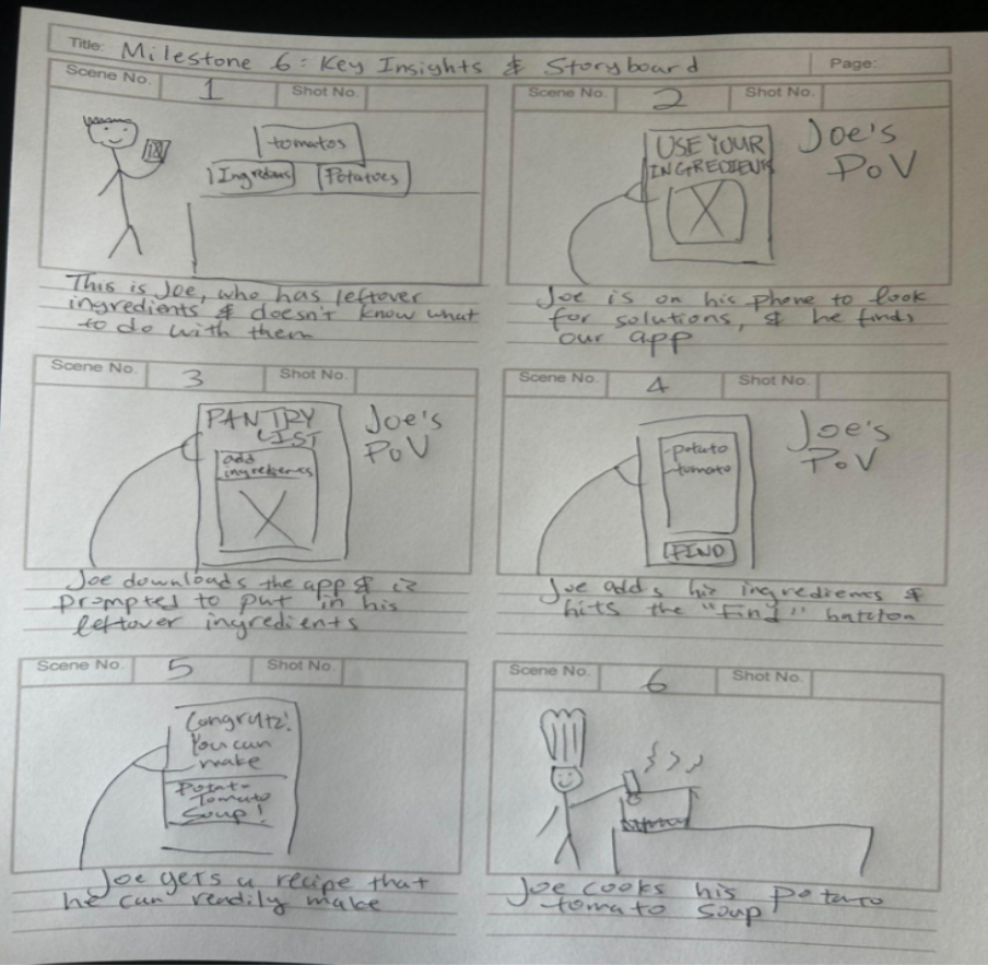
This storyboard is representative of people who have leftover foods that they let spoil because they do not know how to use the ingredients. This is a process that we believe a user would face. Based on interviews such as Evan's interview #1 mentions cheese and milk as foods that quickly spoil and are not used. In Jeffrey's interview #2, the interviewee explains how the recipes they were originally going to cook does not suit their current appetite, so they let the food go to waste. There are also people who just do not know what recipes are available with their ingredients, as evidenced in Evan's interview #2. The storyboard allows us to think about what features we want to implement to help solve the problem this user is specifically facing.
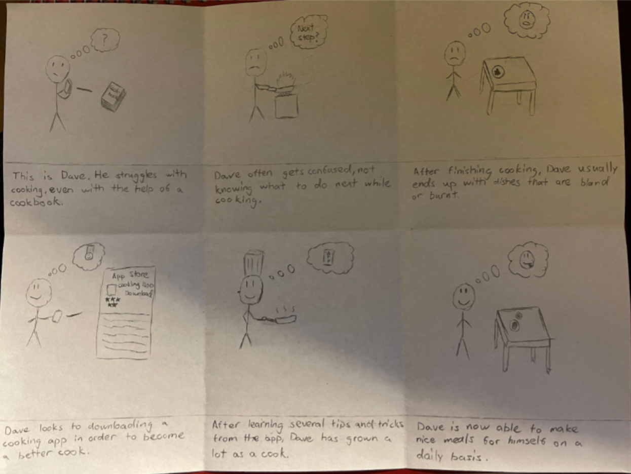
This storyboard is driven by insights gathered from interviews with individuals such as Vigneshwar's interview #2 and Taravee's interview #1 who struggles with following recipes and desires consistently delicious food. The user is portraying the need to overcome difficulties with recipes. While they are frustrated they still want to improve their skills. The user would also reflect the insight that people seek opportunities to enhance their culinary abilities shown in Huan's interviews #1 and #2. There would be some sort of progress as they gain confidence and mastery in the kitchen, leading to the resolution successfully achieving their goal of consistently delicious meals, supported by data indicating the desire for culinary success and satisfaction.
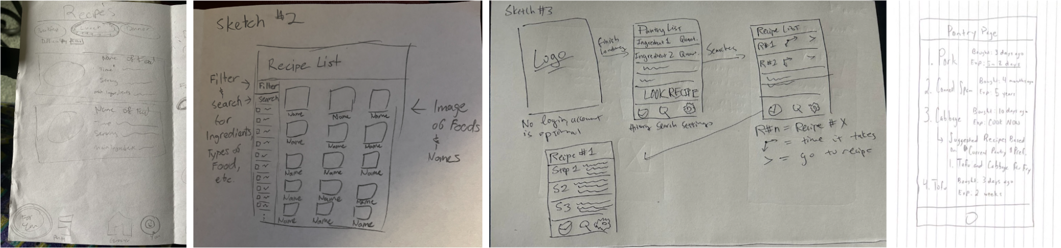
To start this part of our design process, we made several different low-fidelity sketches for the layout of our application. All of these prototypes had their own advantages and disadvantages. As a result, we, as a group, had to deliberate and discuss which key components we wanted to emphasize within our app. After reviewing the sketches, the common theme that we found that were positively impactful was the layout of our screens. With all four sketches, we liked the fact that the information was arranged on each screen and the user should be able to readily know which buttons to click on to satisfy their needs. For example, in the top left image, it offers the key recipe information in order for the user to make a concise decision. Additionally, the “Recipe List” appeals to the user's taste preferences as it offers a filter and search option along with the images and names of recipes that have been outputted. These certain designs simplify the user's previously difficult home cooking experience.
Overall, we spent a lot of time making sure our product was easy to use, while still providing as much functionality as possible. We wanted to make sure that we were not leaving out any functions that people would want to use in an application like ours. By the end of our mid-fidelity prototypes, our product was coming together.
The following are some sketches of the recipes list and pantry list tabs of the app:
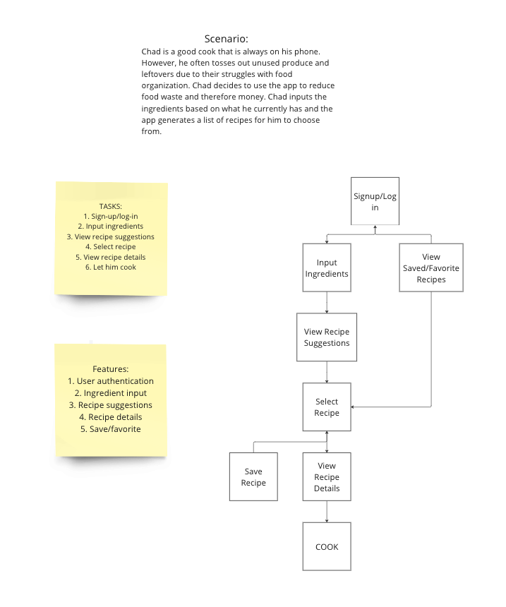
We created several analyses on how users would actually use our product. To do this analysis, we first made a scenario where our user would use our application in. Then, we made a hierarchy diagram for the scenario. While doing this, we were able to better understand the potential user flows and complexity of our application. We considered the tasks the user and the system would need to perform to address the users needs. Based on our low-fidelity sketches and task analysis, we decided to have four main pages for our mobile app: a recipes list to track all recipes the user saves, a pantry list to track all produce the user currently processes, a grocery list to track all the produce the user needs to get, and a gallery that lets users browse and find recipes which they can add. The following is one of the many task analysis done for a new user attempting to view recipes based on the ingredients they have available:
We tested the initial design ideas by discussing amongst ourselves within the group as well as conducting in-class peer reviews. Generally, the mid-fidelity prototype was well-received by our peers because they believed that our design was very simple, but it was effective in solving the pain points and needs as depicted in the persona and storyboards. The inclusion of a search bar, filters, and sorting options allowed the user to customize their app experience. The simplicity of our prototype is able to enhance user friendliness and usability since the screens are intuitive allowing the users to quickly understand the functionality of each feature.
However, our prototype also had some suggestions given to us by our peers regarding certain designs along with its functionality. First, peers mentioned that there are certain information that needs to be integrated into the screen in order to provide a better solution to the problem statement. The inclusion of information such as prep time and recipe's level of difficulty can be included in the preview screen in order to increase efficiency and shorten the time it takes the user to find a recipe they would like to cook. Additionally, a peer stated that each of our design features must revert back to our problem statement and ensure that it is effectively solving it. Each design feature must be able to answer the question, “How does this help home cooks make meals at home an easier process?”
The following are some figma frames from each tab of the app:
We tested our initial design ideas through reviews from each team member and in-class peers. The reviews had a mix of positive and negative comments. We had many positive feedback regarding the color scheme of our app; people believed that the colors matched the whole food theme which was our original intention. However, there was one aspect where adjustments needed to be made regarding coloring. People believed that the gray dropdown menus were too contrasting against the color scheme of our app. The gray clashed with the yellow and orange which received criticism.
Additionally, the sizing of the dropdown menus should be changed in order to match the width of the entire screen. With the difference in sizing, it enhances usability because the selection area becomes larger thus decreasing the likelihood of misclicks. Also, we received suggestions regarding “Call to Action” designs such as the design of our “Add” button on our dietary restrictions. It was noted that the “Add” button blended in with the rest of the screen and it was not obvious to the user that the button was there for them to put to use. By keeping this concept in mind throughout the entire design process, we, as designers, can somewhat influence the users to take advantage of most, if not every, design feature.
Lastly, we received positive feedback on certain design implementations that enhanced the user experience and simplified the home cooking process for them. The inclusion of video tutorials within our view recipe screen was well received since the purpose of it was to guide beginning home cooks through recipes in order to ensure that their meals are as ideal as possible. Also, the variety of filters that we included implied that users' taste preferences were a high priority of ours which it was. By including a set list of filters and allowing users to manually search for filters, the app becomes customizable for each user.
The following are some figma frames from each tab of the app:
After multiple iterative design and development processes, the final result of our designed work was a high fidelity prototype. The final result of the design work for Cookin' is a user-friendly, feature-rich interface that empowers users to manage their recipes, pantry and grocery lists efficiently. This comprehensive and intuitive interface also enables users to view individual recipes when cooking, and explore recipes that are public. Whether they are looking for quick Ready-to-Cook options or want to find new recipes, the navigation tab provides seamless navigation between the Recipes List, Pantry, Groceries and Public Recipes tabs. The clean and intuitive design enhances the user experience, making it a valuable tool for anyone passionate about cooking and meal planning.
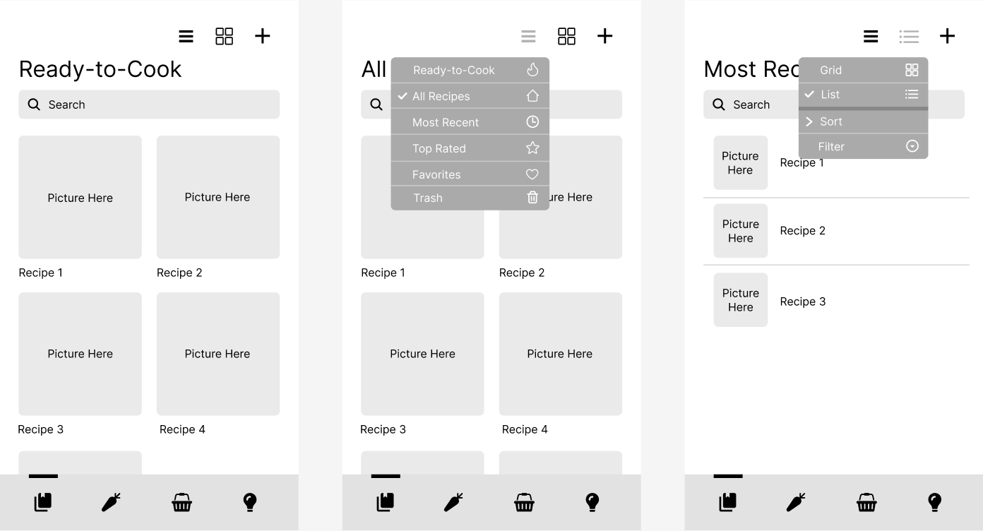
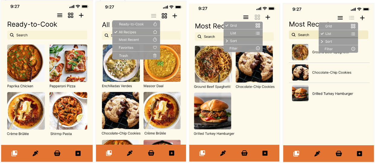
The Recipes List tab offers a comprehensive and intuitive interface for users to manage their recipes efficiently. One of the main features is to view recipes by categories. The Ready-to-Cook category displays recipes that can be made currently based on available ingredients the user listed in the Pantry tab. The All Recipes category shows all recipes the user added. The Most Recent category shows recipes that users added or viewed recently. The Favorites category lists recipes marked as favorites for quick access. The Trash category is where deleted recipes can be temporarily stored before permanent deletion.
There are also several viewing options to change the format the recipes are displayed in: grid form and list form. The grid view allows users to view recipes in a grid layout for a visual overview, while the list view displays recipes in a list format for detailed information. There are also sorting and filtering abilities. Users can sort and filter recipes by cooking time, difficulty to make, alphabetical order and easy search. There is always a search bar which users can manually type in to manually find a recipe by its name.
Recipes can be added to the user's list in multiple ways. Users can scan recipes using their device's camera for quick entry or have the option to select images from the camera roll for recipe entry. They can also input a URL to import recipes from websites. Another option is to compose manually which provides a form to enter their recipe details manually for customization.
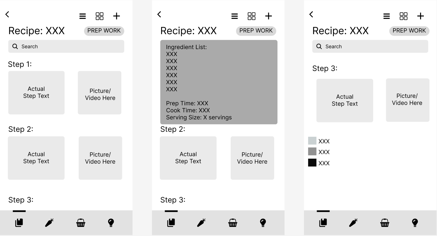
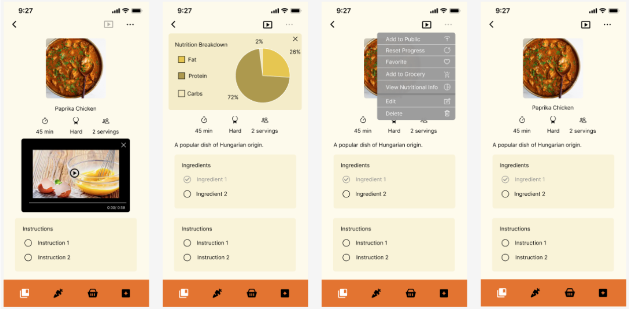
Each recipe can be clicked on and viewed individually. Clicking on a recipe card opens a detailed view with its image, description, duration, difficulty, serving size, ingredients and instructions. Users can checkmark ingredients in their possessions or they are automatically marked if they are present in the Pantry tab. They can also checkmark instructions that they have completed. There is also a drop down menu, accessible through the three dot icon in the top right corner. In it, the user has the ability to add the recipe to “Public Recipes”, reset the check mark progress of the recipe, favorite the recipe, add the ingredients of the recipe to the grocery list, view its nutritional information, edit the recipe, and delete the recipe. Lastly, there is a video option, accessible through the video icon in the top right corner. Clicking the video icon will let an instructional video pop out to show how the recipe is meant to be cooked.
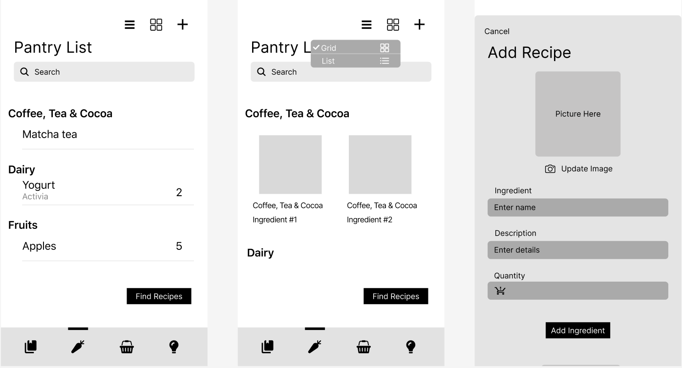
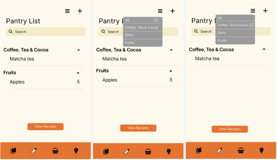
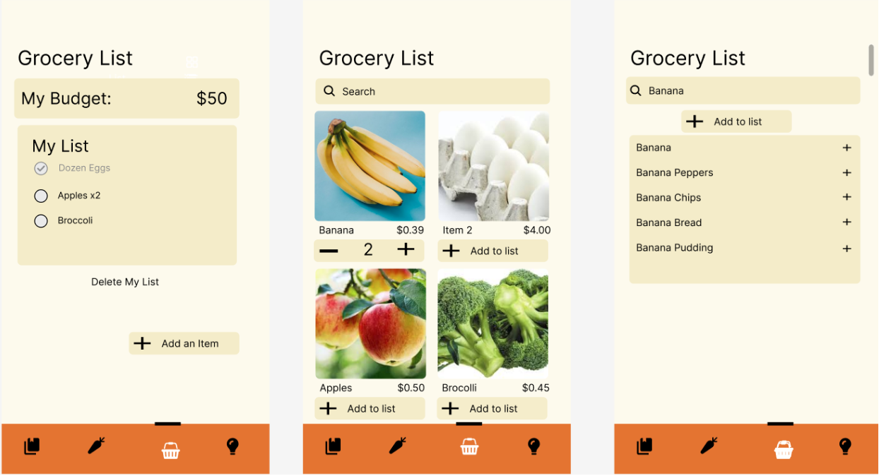
The pantry list provides a simple interface for the user to view, edit, and add ingredients. Additionally, they are able to filter which ingredients they want to see by category, as ingredients may add up over time. Finally, they are also able to search for ingredients in their pantry list for the same reason. While viewing a specific ingredient in the pantry list, the user can see the details of the ingredient, including the name, quantity, description, and expiration dates. The user can also edit some of the information if they choose to. Next, the user can add ingredients in three ways: receipts, online search, or manually. Scanning receipts allows the user to batch add ingredients they have recently purchased, online search allows users to find ingredients from online sources, and manual adding allows the user to fully customize the details of the ingredient they want to add. Finally, the user can collapse the categories of the ingredients for a better viewing experience.
The grocery list is a way for users to keep track of the items they may buy. Users are able to add items from a grid like page that includes pictures, average price and an option to increase the quantity of the item. There is also an option to search for ingredients where the application would populate multiple items that they had searched for. They are able to add the item to the list. The list would include everything they added, a budget amount at the top, an option to add more items, and the ability to delete the list if they want to restart. The list has an option to check and uncheck items they may have already bought. This allows the user to be able to keep track of all the items they would need.
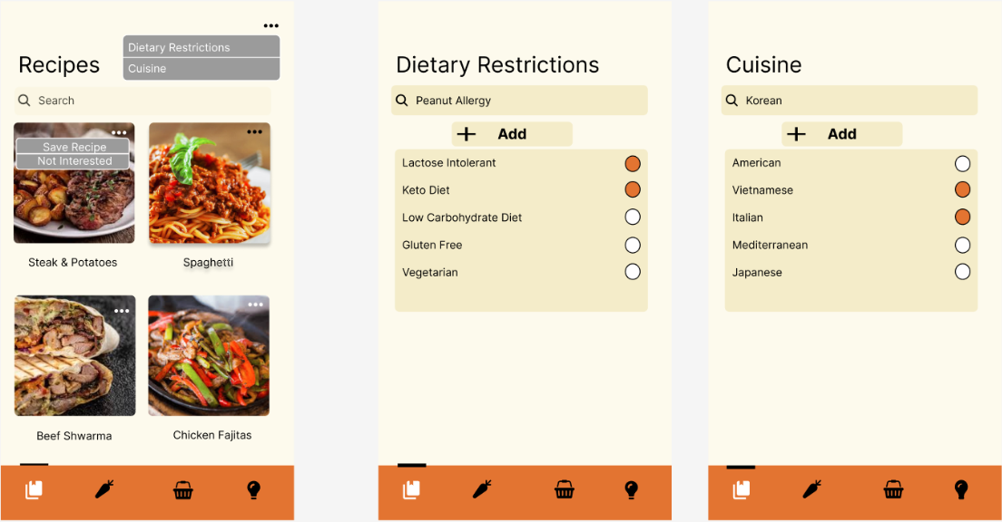
Users can view community recipes, which are recommended to the user based on their recipe lists, recipes interacted with (checkmarked ingredients, favorites, etc.) and other preferences options listed in the browse recipes tab. With each recipe, the user has the choice to either save the recipe or mark it as “not interested.” This functionality will allow users to slowly curate the recipes they find in the community tab to be more and more in line with their personal preferences. On the top right of the screen, the user can press on the triple dot icon to filter by cuisine and/or dietary restrictions. In the cuisine filter, the user can currently filter between American, Vietnamese, Italian, Mediterranean, and Japanese foods. In the dietary filters, the user can select their allergies or eating preferences. Under both categories, the user has the ability to use the search bar menu to find other cuisines and/or dietary restrictions that they would like to add to their personal profile.
If more resources were available to enhance Cookin', there are multiple features each with actionable steps that can improve its functionality: tagging system for recipes, user-created recipe categories, and general enhancement of recipe functionality. These features and functionalities can provide users with a more robust and personalized cooking experience. It enhances recipe discovery, organization, and interaction. This can make the cooking more enjoyable and efficient for users of all levels.
The first feature to implement will be a tagging system which involves several actionable steps. User-friendly tagging interfaces will allow users to effortlessly add tags to their recipes, such as cuisine, dietary, holidays/special occasions, and price. The tagging system will be integrated with the filtering and sorting functionality and the app's search and browsing functions. This will give users the ability to easily and conveniently filter recipes based on these tags, thereby facilitating the discovery of recipes that align with their preferences.
The inclusion of category management will offer users the ability to create their own custom recipe categories. This feature would also include options to edit and delete categories as needed, providing a personalized organization system tailored to each user's preferences. A drag-and-drop interface will enable an intuitive way for users to add recipes to their custom categories. This interface would allow users to easily organize their recipes according to their chosen categories, improving the overall usability and efficiency of the app. To ensure a seamless user experience, the custom categories would be designed to sync across devices. This feature would enable users to access their organized recipes from any device, ensuring that their personalized categories are always available whenever and wherever they need them.
A rating and feedback system will allow users to provide ratings and leave comments on recipes they've tried. This system not only helps users make informed choices but also provides valuable insights for other users browsing the app. Another addition will be the recipe import feature that would enable users to import recipes from other cooking sites or apps. This functionality would involve parsing recipe data from various formats and automatically populating the app with imported recipes, expanding the app's recipe library. Additionally, a voice-generated recipes feature will enable users to verbally describe a recipe. The app would then convert this description into a formatted recipe card, streamlining the process of adding new recipes.
There will also be more features when viewing a specific recipe: timers, serving size scaling, and pinning active recipes. Users can set timers for cooking steps directly within the app for better time management. Serving size scaling will allow users to adjust recipe servings and automatically scale ingredient quantities accordingly. A pinning active recipes feature will allow users to "pin" or mark recipes they are currently cooking. This would create a designated section in the app where users can easily access and reference their active recipes. All these additions will improve organization and usability.